Revamping Sportbench
Enhancing User Experience and Engagement
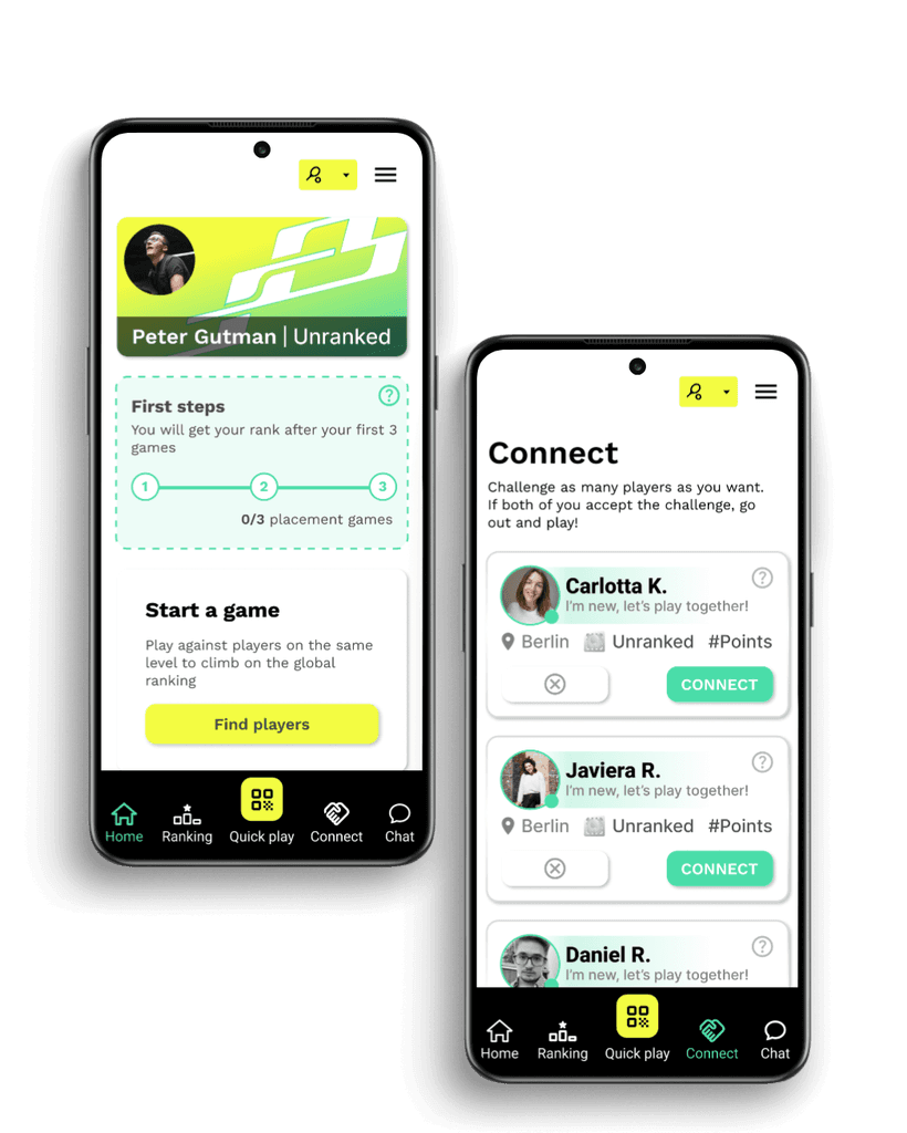
I teamed up with Sportbench to quickly create a basic design system for their product, following the MVP approach. We focused on essential elements through research and testing, ensuring a lean structure. By prioritizing key features and crafting simple, user-friendly designs, we laid a strong foundation for their product launch. Our goal was to provide a solid starting point for future improvements based on user feedback
Research
Competitors Analysis
Usability Testing
UX/UI Design
Stakeholder Management
Understanding Sportbench
Sportbench is a innovative german startup, committed to revolutionizing your sports experience. Connecting players on their same level, managing an elo-ranking sytem and organizing tournaments with distinguished sponsors such as Butterfly and also funded by:
Sprint Priorities
Improve User Enrolment
UI Improvements
Usability Testing
Develope an onboarding process
Design system

Secondary Research and Survey Results
We conducted extensive surveys through Google Forms, targeting over 100 completed responses. The surveys were distributed among active Sportbench newsletter subscribers, Slack, and Discord communities, resulting in a successful collection of responses. Additionally, we conducted user interviews using Zoom and Google Meet.
67,6% of the users are male.
38,54% are around 26–35 years old
88% play for fun as a motivation
73,9% “Easy scheduling options” an essential feature
User testing the old App version
Confusing user interface
Users found the buttons and navigation confusing, especially the QR page and match start buttons.
The purpose of the 0/3 button on the congratulation screen was unclear.
The subscription screen lacked clarity on the value of paying for a subscription
Lack of clarity on features
Users were unsure about the purpose of certain buttons, such as the logo button and the handshake icon.
The profile visitors feature was confusing and users didn’t understand its purpose
Using your personal Whatsapp for meetings
Interest in challenging others
Users expressed interest in challenging others and liked the idea of the app as a platform for competition.
Some users wanted more information on what they were competing for.

Conclusion
The evaluation reveals significant opportunities for clarity improvements within the interface and feature set. Users expressed confusion with certain buttons and noted instances where screen layouts lacked clarity. Additionally, there were challenges in understanding the intended purposes of key elements such as the logo, icons, and profile visitors feature. Addressing these issues will be crucial for enhancing usability and ensuring a more intuitive user experience moving forward.
A visual representation of the old app concept
Guiding users through arranging matches and navigating the ranking system.
Users arrange a match using Whatsapp's groups
Players Meet
Scan the QR code of the opponent
Start the match
Select the winner
Elo-rating evaluation
Ladder up in the ranking
Let's take a look at the problems and solutions
After briefly explaining the concept of the application to understand what we are talking about, let’s take a look at the problems and the solutions that we would like to implement
Problems
The App is cluttered
The App is not intuitive
User's don't really know how to use the App
Users were unaware of placements games
Who to play with?
Solutions
Simplify UI
organization of the menu and clear labels
Creating a first steps tutorial
Highlighting it and explaining what is about
Clear instructions on how to connect with other users
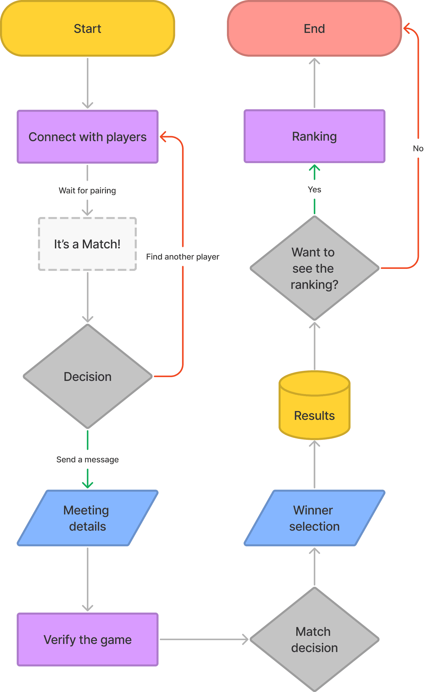
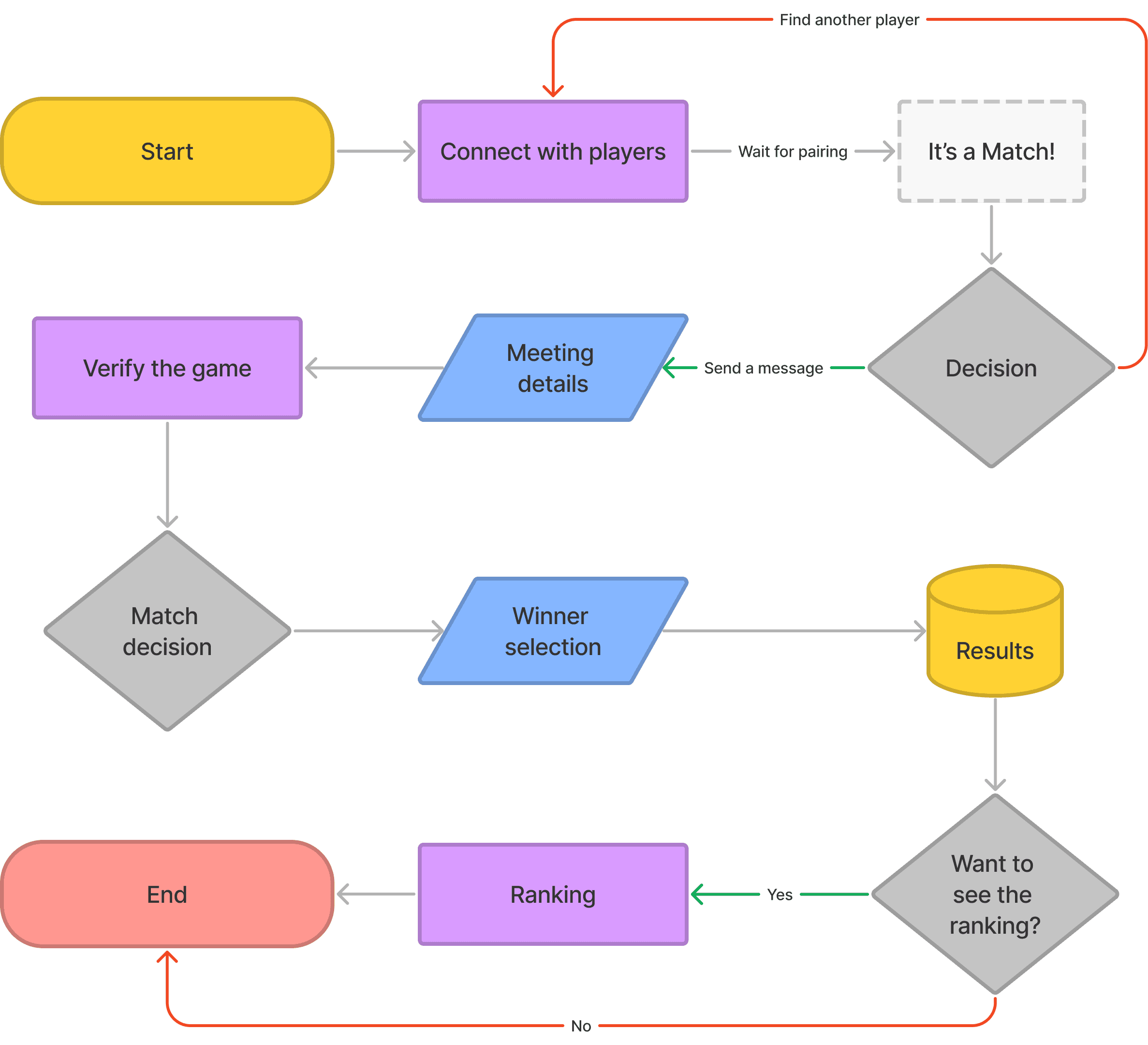
So, after bringing these two problem trees, we managed to start creating the user flow to have a clear view of how our new user flow works.
Tutorial
In response to the need for enhanced user understanding, we have strategically developed a tutorial for our application. This tutorial serves as a valuable resource to guide users through the features and functionalities of our app, ensuring a more intuitive and user-friendly experience.
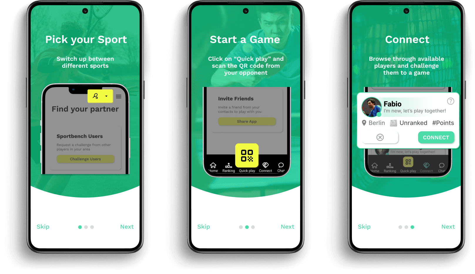

Participants highlighted the importance of incorporating a tutorial to benefit users. They appreciated that the layout prevented them from feeling overwhelmed. The color scheme maintained the essence of racket sports vibes, and the newly introduced ranking system proved easier to comprehend, resembling the familiar ranking systems found in games. This familiarity was seen as a motivating factor, surpassing other options.
Gamify concept
We came up with the idea of generating engagement by applying a gamified concept. This involves offering visuals related to common games and allowing users to level up their skills, which are then displayed on a League scoreboard. The main objective is to attract more users to the platform and enhance the ‘duel’ feeling, similar to a fighting game.
After considering several concepts, we decided to maintain the same vibes as the old interface. This way, users won’t notice a drastic change; instead, they will see familiar elements related to the old app.

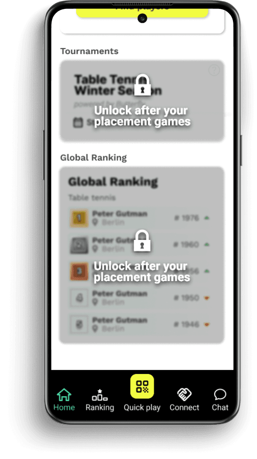
We’ve amplified user engagement by introducing an extra layer of interaction — certain features are now locked, enticing users to perform specific tasks within the app.

Screen comparison
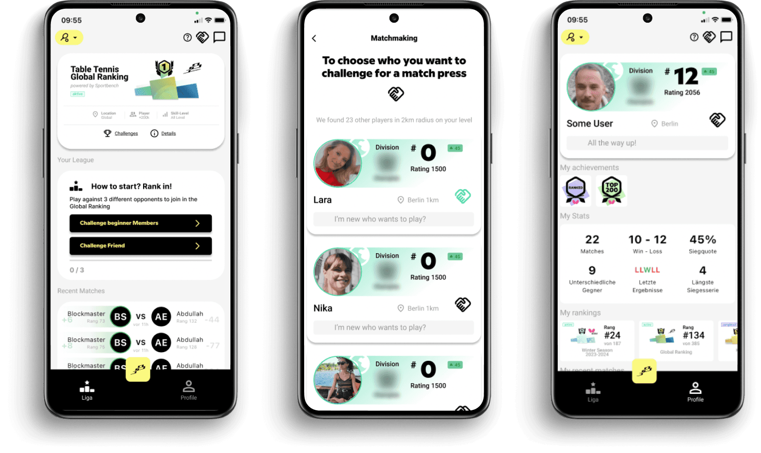
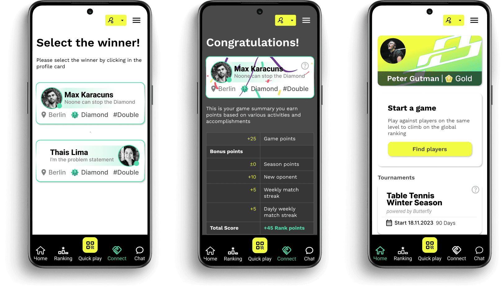
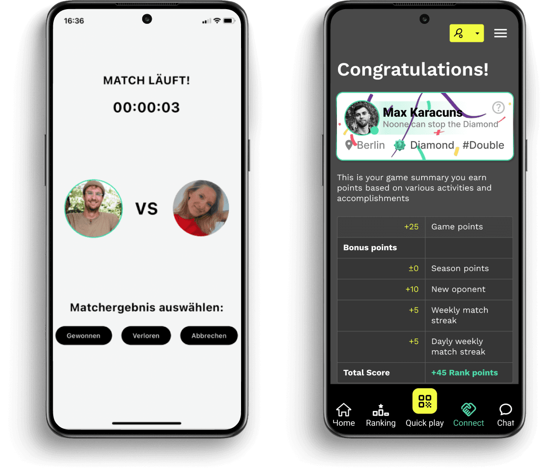
Users faced confusion with the old ‘Congratulations’ screen as they were uncertain about the origin of the points and how they earned them. Through extensive testing, we have successfully enhanced our version, providing users with clear and easily understandable information.
Now, let’s compare the two versions.

User testing the NEW App version
We conducted several testing were we drove our users through a role trying to finish the task of finding a player and playing a game from start to finish.
Great news, all users completed the task succesfully.
Gameplay Experience:
Users appreciate the “connect” button and the importance of playing with three placement games to know their rank.
Understanding of the QR code concept is clear and positive feedback on the victory screen, personal ranking, and progress bar.
Homepage and Design:
Positive feedback on the clarity of the progress bar on the new homepage.
Recognition of the new design trying to comunicate the requirement to play three games before qualifying.
Onboarding:
Positive response to onboarding steps explaining the app’s goal.
Users appreciate onboarding questions that help determine their chosen level.
A/B Testing the lock/unlock feature:
Positive feedback on the lock feature area encouraging continued play.
Appreciation for real player scores and a clear understanding of divisions in the A/B testing.
The A/B test had to help us to find out what users thought regarding the new functionalities and user experience, and also to find out if the improvised feedback stage done in the middle of the process was useful or not.
Design system
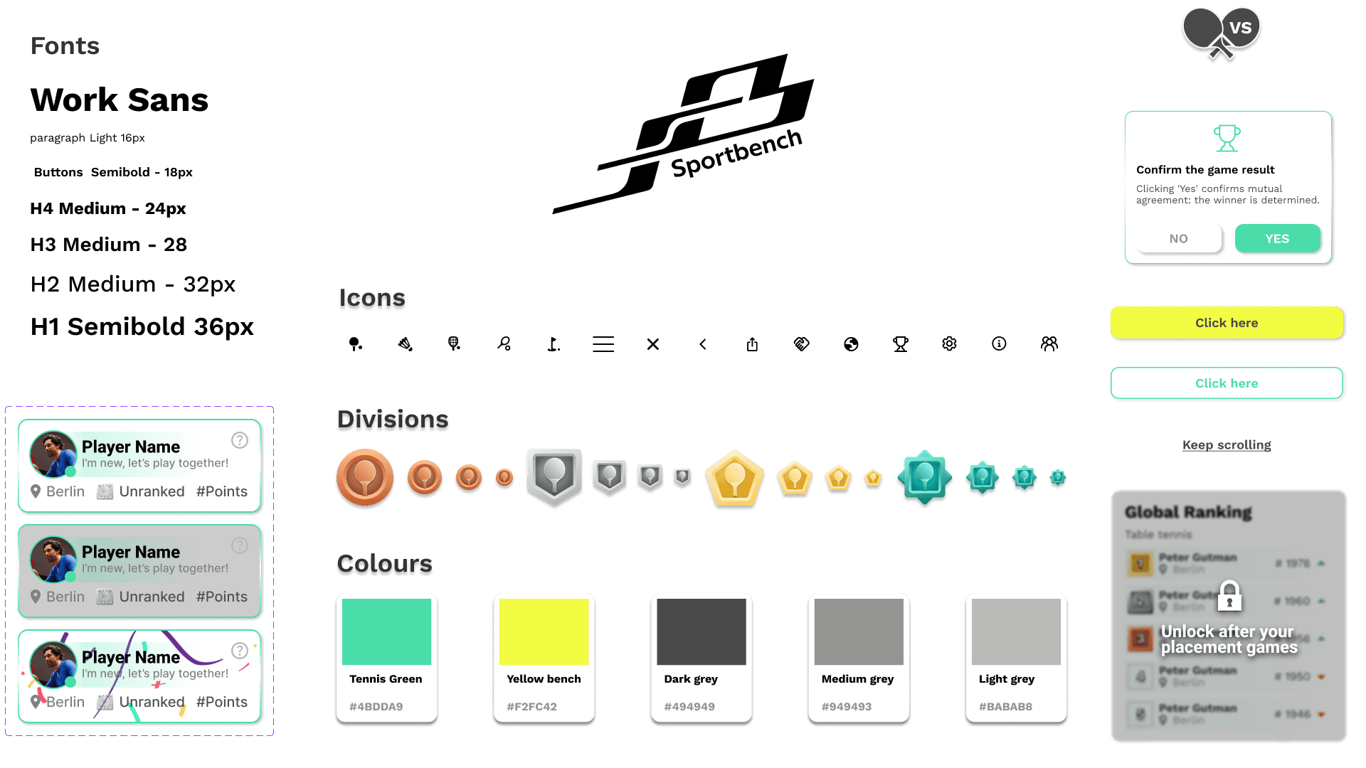
With the design closed, I created the design system to make easier the development process and also to have the guidelines for future new functionalities on the APP.

High-fidelity prototype
With the functionalities agreed and the user experience completed, I did all the visual design of the APP. I used a simple palette of colors which included the corporate colors and a small palette of neutral colors, together with a clear and simple iconography.
Key Learnings
Determining the understanding of the concept through user testing is not consistently a linear process.
Effective project outcomes hinge on active communication within the team.
Efficiently organizing your design system requires dedicated effort, but it is an indispensable task.
100% accessible AAA design isn’t easy. It drastically impacts UI and raises app development costs with numerous versions.
Next Steps
As we had other tasks to handle during our collaboration with Sportbench, we developed many concept ideas that could be awesome additions to the current app.
Effective stakeholder management is a crucial aspect in project development.
As 88% of active users play for fun, we considered integrating ‘open tables,’ allowing users to join and connect with the community, this could be an exciting feature for enhancing engagement within the app.
We aim to persist in user testing to further refine the overall experience, ensuring the product remains user-friendly and aligns seamlessly with our users’ needs.
I’d like to express gratitude to Sportbench, particularly to Raphael and Tobias, the Co-founders, for entrusting us with this project. It has been an excellent opportunity for mutual growth, and we sincerely wish you nothing but success.

Revamping Sportbench
Enhancing User Experience and Engagement
I teamed up with Sportbench create a new design for their product, following the MVP approach. We focused on essential elements through research and testing, ensuring a lean structure. By prioritizing key features and crafting simple, user-friendly designs, we laid a strong foundation for their product launch. Our goal was to provide a solid starting point for future improvements based on user feedback.
Research
Competitors Analysis
Usability Testing
UX/UI Design
Stakeholder Management
Understanding Sportbench
Sportbench is an innovative german startup, committed to revolutionizing your sports experience. Connecting players on their same level, managing an elo-ranking sytem and organizing tournaments with distinguished sponsors such as Butterfly and also funded by:
Sprint Priorities
Improve User Enrolment
UI Improvements
Usability Testing
Develope an onboarding process
Design system


Secondary Research and Survey Results
We conducted extensive surveys through Google Forms, targeting over 100 completed responses. The surveys were distributed among active Sportbench newsletter subscribers, Slack, and Discord communities, resulting in a successful collection of responses. Additionally, we conducted user interviews using Zoom and Google Meet.
67,6% of the users are male.
38,54% are around 26–35 years old.
88% play for fun as a motivation.
73,9% “Easy scheduling options” an essential feature.
User testing the old App version
Confusing user interface
Users found the buttons and navigation confusing, especially the QR page and match start buttons.
The purpose of the 0/3 button on the congratulation screen was unclear.
The subscription screen lacked clarity on the value of paying for a subscription.
Lack of clarity on features
Users were unsure about the purpose of certain buttons, such as the logo button and the handshake icon.
The profile visitors feature was confusing and users didn’t understand its purpose.
Using your personal Whatsapp for meetings.
Interest in challenging others
Users expressed interest in challenging others and liked the idea of the app as a platform for competition.
Some users wanted more information on what they were competing for.


Conclusion
The evaluation reveals significant opportunities for clarity improvements within the interface and feature set. Users expressed confusion with certain buttons and noted instances where screen layouts lacked clarity. Additionally, there were challenges in understanding the intended purposes of key elements such as the logo, icons, and profile visitors feature. Addressing these issues will be crucial for enhancing usability and ensuring a more intuitive user experience moving forward.
A visual representation of the old app concept
Guiding users through arranging matches and navigating the ranking system.
Users arrange a match using Whatsapp's groups
Players Meet
Scan the QR code of the opponent
Start the match
Select the winner
Elo-rating evaluation
Ladder up in the ranking
Let's take a look at the problems and solutions
After briefly explaining the concept of the application to understand what we are talking about, let’s take a look at the problems and the solutions that we would like to implement.
Problems
The App is cluttered
The App is not intuitive
User's don't really know how to use the App
Users were unaware of placements games
Who to play with?
Solutions
Simplify UI
organization of the menu and clear labels
Creating a first steps tutorial
Highlighting it and explaining what is about
Clear instructions on how to connect with other users
Userflow
So, after bringing these problems to the table, we managed to start creating the user flow to have a clear view our new user flow.


Tutorial
In response to the need for enhanced user understanding, we have strategically developed a tutorial for our application. This tutorial serves as a valuable resource to guide users through the features and functionalities of our app, ensuring a more intuitive and user-friendly experience.


Participants highlighted the importance of incorporating a tutorial to benefit users. They appreciated that the layout prevented them from feeling overwhelmed. The color scheme maintained the essence of racket sports vibes, and the newly introduced ranking system proved easier to comprehend, resembling the familiar ranking systems found in games. This familiarity was seen as a motivating factor, surpassing other options.
Gamify concept
We came up with the idea of generating engagement by applying a gamified concept. This involves offering visuals related to common games and allowing users to level up their skills, which are then displayed on a League scoreboard. The main objective is to attract more users to the platform and enhance the ‘duel’ feeling, similar to a fighting game.
After considering several concepts, we decided to maintain the same vibes as the old interface. This way, users won’t notice a drastic change; instead, they will see familiar elements related to the old app.


We’ve amplified user engagement by introducing an extra layer of interaction — certain features are now locked, enticing users to perform specific tasks within the app.


Screen comparison
Users faced confusion with the old ‘Congratulations’ screen as they were uncertain about the origin of the points and how they earned them. Through extensive testing, we have successfully enhanced our version, providing users with clear and easily understandable information.
Now, let’s compare the two versions.


User testing the NEW App version
We conducted several testing were we drove our users through a role trying to finish the task of finding a player and playing a game from start to finish.
Great news, all users completed the task succesfully.
Gameplay Experience:
Users appreciate the “connect” button and the importance of playing with three placement games to know their rank.
Understanding of the QR code concept is clear and positive feedback on the victory screen, personal ranking, and progress bar.
Homepage and Design:
Positive feedback on the clarity of the progress bar on the new homepage.
Recognition of the new design trying to comunicate the requirement to play three games before qualifying.
Onboarding:
Positive response to onboarding steps explaining the app’s goal.
Users appreciate onboarding questions that help determine their chosen level.
A/B Testing the lock/unlock feature:
Positive feedback on the lock feature area encouraging continued play.
Appreciation for real player scores and a clear understanding of divisions in the A/B testing.
The A/B test had to help us to find out what users thought regarding the new functionalities and user experience, and also to find out if the improvised feedback stage done in the middle of the process was useful or not.
Design system
With the design closed, I created the design system to make easier the development process and also to have the guidelines for future new functionalities on the APP.


High-fidelity prototype
With the functionalities agreed and the user experience completed, I did all the visual design of the APP. I used a simple palette of colors which included the corporate colors and a small palette of neutral colors, together with a clear and simple iconography.
Key Learnings
Determining the understanding of the concept through user testing is not consistently a linear process.
Effective project outcomes hinge on active communication within the team.
Efficiently organizing your design system requires dedicated effort, but it is an indispensable task.
100% accessible AAA design isn’t easy. It drastically impacts UI and raises app development costs with numerous versions.
Next Steps
As we had other tasks to handle during our collaboration with Sportbench, we developed many concept ideas that could be awesome additions to the current app.
Effective stakeholder management is a crucial aspect in project development.
As 88% of active users play for fun, we considered integrating ‘open tables,’ allowing users to join and connect with the community, this could be an exciting feature for enhancing engagement within the app.
We aim to persist in user testing to further refine the overall experience, ensuring the product remains user-friendly and aligns seamlessly with our users’ needs.
I’d like to express gratitude to Sportbench, particularly to Raphael and Tobias, the Co-founders, for entrusting us with this project. It has been an excellent opportunity for mutual growth, and we sincerely wish you nothing but success.
